When you give, you’re more likely to get back. Nonprofit organizations everywhere are always in need of your help. Nonprofit organizations everywhere are always in need of your help. They all serve a purpose to further their cause. You may wonder, “Why should I give away my hard earned money to a nonprofit organization?” Giving back to nonprofits not only fosters a company growth but provides other benefits as well. The benefits of donating to a nonprofit organization:

Support Important Causes– By giving to a nonprofit organization, you will support causes that are important to you. When you donate, you are directly helping to remedy the problem which the organization works to address.

Feelings of Satisfaction– People generally fell better about themselves after helping those in need, and you can too. You may save a life or help others who are less fortunate.

Tax Deduction– A benefit of donating to a nonprofit organization, one which you will most likely find to be the most tangible, is a tax deduction.

Remember, it’s always better to give than to receive. The glory of donation to a nonprofit organization is that you give and receive at the same time.

Fight for a cause and make a difference!

To reach people plugged into their social media outlets, Instagram is a wise way for brands to connect with consumers. Instagram, specifically, is brimming with businesses that use the popular photo app to optimize awareness of their product or service.

One way businesses use Instagram to generate awareness is by connecting with their followers in a realistic way. They look beyond fancy, staged photography. Instead, they are shifting to authentic photos. Why? Consumers can see themselves as part of the photo and, ultimately, they see themselves using the product or service in their daily life.

 For example, Starbucks connects with consumers by capturing a moment in time we would all like to experience: an appetizing picnic, complete with refreshing Starbucks beverages (a fun and easy idea for a beautiful summer day).

Want to increase your brand awareness through Instagram? AMPs is here to assist you.

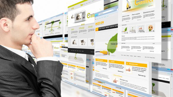
Basic is beautiful. Ornate is overkill. This is the adage that effective websites are following these days.

The more clutter that is displayed on a website, the less likely viewers are going to stick around for long.
Even The Atlantic, Amazon and other established brands across all markets have embraced the Facebook-style, blog stream display.

Awwwards.com honors websites on their design, creativity and innovation. Every nominee on the front page is the same simple, 1-2 picture layout. The clean layouts are especially favorable where mobile usage is growing and information is gathered on a display no bigger than the palm of the reader’s hand.  This is why it’s important to fill the frame with meaning, not distraction.
 Ray Ban U.S.A.’s website seems to break this theory. It features a lot of innovative graphics, but a lot of which don’t seem to necessarily help to advertise glasses. Of course, the name alone will sell their product, so a website design might not be the biggest difference maker. Warby Parker, however, the American start up who is starting to give Ray Ban a run for its money, follows suit with the tidy display and showcases a few options against a clean white background.

Although the advertisement on CBS Radio Baltimore is busy itself, it’s distracting from the already busy layout.

New York Times is the exception that makes the rule. NYTimes.com still looks like its paper that you picked up 25 years ago. This is their brand, and this is what works for them.
Of course, they know most viewers will not read even half of what they display on their front page, but instead do know where viewers will look.  An ad prominently displayed across the top catches the eye right away. The two most important stories are displayed on the top left corner and right and top middle with an accompanying image that is larger than any other story image on the page.

Scrolling downward, there’s a few pictures to accompany stories, followed by its video section, where the featured video image takes up ¾ of the page. Below that, every section of the newspaper is displayed, but in an even smaller block than the ocean of headlines up above. There’s a plethora of content, but designers know most of it won’t be read by the average viewer.

Keep your website simple. Large images draw readers in and allow for easier navigation. Clean display sells and draws readers in.

31 Jul 2015

Try, try again

Let’s see if you’ve experienced anything like the following.

While surfing the web I came across an ad for a beautiful dress. I clicked the ad just to see what the price might be. I admired the dress but I didn’t want it. Well actually, to be more accurate I shouldn’t spend money on a dress. I should buy something more sensible like, I don’t know, groceries. So I leave the site and head to any number of websites during my daily eight hours behind a computer screen.

But then a funny thing starts happening. I begin to see this dress ad everywhere. I saw the dress ad on YouTube, on news sites and even on Facebook. After about three days I buy the darn dress because clearly it was following me around like a lost puppy and it needed a home.

So what happened here? This is known as behavioral retargeting, or simply as retargeting. It is a form of online-targeted advertising by which digital advertisers identify consumers based on their previous Internet actions that did not result in a conversion.

Let’s break it down. Every sales person can tell you that your first email contact or phone call will not likely result in a sale. In the same way, approximately 97 percent of the people who visit your website will not convert on their first visit. This loss of potential sale is huge, which is why, as any good sales person knows, follow up is the key.

With retargeted ads, you follow the people who left your site on their journey to other websites. They might next go to ESPN’s website and suddenly your ad is now popping up as a banner ad on this website. Maybe after that they look up some restaurants and you pop up again. Subtly, you are beginning to take up residence in their mind and building your brand awareness.

These retargeted ads produce two positive effects. By building your brand awareness, when your customer is ready to buy he or she remembers your name and goes back to your site. Or, during the time your ad is seen again, they click to your site and make the purchase.

What sales are you missing right now? Talk to AMPs today about how you can recapture your traffic with retargeted ads.

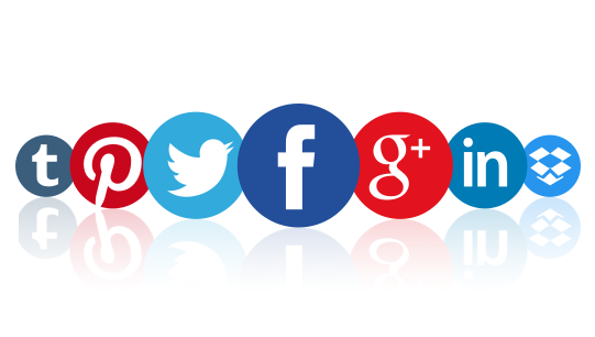
So, you want to use social media platforms to promote your business, but you don’t know where to start. Let us guide you on your way into the world of major outlets.

The first thing to keep in mind is that not one is inherently better than others for everyone. You must make your choice based on your company’s brand, needs, and your ability to engage.

Facebook

What: Facebook has the business of paid advertising down and though they keep tweaking it, it’s fairly straightforward and easy to use. You can promote a post or create an ad for as little as $5 and they provide helpful tips for how and why to spend more money. Whether you choose to pay for content promotion or not, Facebook is a good place for regular updates about your company.

How: First, you’ll need to create a business page with a logo, inviting visuals and a few posts that give updates about the company. Start accumulating a fan base by inviting your friends to “like” the page. From there, think about paid social options to expand your likes.

Why: Facebook can be good for a local community, a company looking to attract an older audience and anyone interested in getting their foot in the door.

Twitter

What: Twitter is the place to chime in on whatever conversation your audience is already having. If you’re feeling ambitious, you can even start your own conversation (or hash tag). However, breaking in isn’t as easy as you might think. Paid social is an option on Twitter and works similarly to Facebook, but if you find the right Twitter community and grow your following through consistent content, building an unpaid audience shouldn’t be a problem.

How: You must first decide what your “Twitter personality” is going to be. Are you going to be funny? Informative? Conversational? Figure out your brand personality for engagement, and then set a Twitter schedule. For example, decide every Thursday to do a #throwbackThursday tweet, where you recall memories or photos of memorable events in the past. Ask a question on Wednesdays and wait for answers. Be funny on Fridays and tweet at users who engage. Last thing… always, always, always use a hash tag.

Why: Twitter is a must for brands looking to be active with content marketing. It’s also becoming one of the first places people will look online to find your brand if they want to tag you in a compliment or a complaint.

Instagram

What: Instagram is a place to showcase your best photos and video clips. There’s a real opportunity here to be creative with your photos, using filters and third party apps (such as Layout) to make them pop, as well as long captions and hash tags.

How: Use Instagram for high-end photos (filtered and touched up with apps) or for a behind-the-scenes look at your company (employee spotlights or how-it’s-made clips), but regardless, it’s a good place for storytelling. Use your captions wisely, and remember that a happy account is a followed account.

Why: Instagram is a great place to reach those who are visually inclined. Fitness brands, beauty brands, and lifestyle brands are the top followed accounts on Instagram, other than celebrities

YouTube

What: YouTube is the global TV channel. If you’re at all interested in creating a video, this is the place to go. It’s easy to use, and the YouTube community is rabid. Go viral within 24 hours of your upload. Other video platforms, such as Vimeo, are great for higher end video content, but YouTube is the place to start.

How: Create videos as part of a series. What information do you have to offer in video format, and how can you turn that value into a series of videos? Put together a simple recording setup, invest in lighting, a camera and get started. YouTube is also useful for personal companies, such as therapists or personal trainers, in the form of vlogging (video blogging). Keep it short, keep it simple.

Why: More people are watching video content than ever before, across all devices and platforms. Sign up for a YouTube channel, post the video on Facebook, Twitter and Instagram. It’s that easy!

07 Jul 2015

Latest Website Trends

Every year, we see new website design elements emerge.

You may be asking yourself: But what are the latest features to include in my website redesign? And what elements are most important? Well, we’re here to help.

Here are six important elements of modern website design that you can include. When deciding, please be sure to keep the branding of your company at the front of your mind.

  • Typography
    • Most companies have a particular family, style, and size of a font, or typography, that helps their customers immediately identify the company. In recent years the selection of “web fonts” has grown. Designers can have a broader selection of fonts to choose from on their websites. When creating your company’s brand, it is important to consider the typography. This allows readers to immediately identify your website and brand.
  • Flat Design
    • Flat design is known for its simplistic appearance. Instead of using three-dimensional effects, flat designs use simple illustrations that typically have brighter colors. Additionally, flat design’s style makes the website appear cleaner with more white space. Designers are moving toward creating websites with more whitespace to keep the focus on the content of the website instead of overloading websites with design elements.
  • Hover Effects
    • Hover effects help you identify where you are on a page. When you place your cursor over a part of a website that has a hover effect, it usually changes colors or highlights letting you know where you are looking. It helps drive the viewers focus to the important parts of a website.
  • Scroll to Page
    • The newest feature to populate websites is the scroll to page effect. This allows users to continually scroll down on the landing page and see important content. It removes the extra step of the user clicking on a link to redirect them to a page. It also helps previous visitors to your site who may be looking for one piece of information they saw before, and with scrolling, they can get to the section of the website page where it exists easier and quicker.
  • Giant images
    • Have you noticed the graphics on sites getting larger and larger? Yes, that’s the new trend. Larger images help designers highlight different features in a more efficient and effective way. This tactic keeps the visitor thinking about the service with the visuals. We are bound to skim over a lot of text, but with the large images, we are able to get a solid idea of what the services do and convey it through images instead of words.
  • Videos
    • Nowadays … what’s a website without a promotion video? Hardly anything. In addition to large images, companies are also beginning to use promotional videos to talk about the benefits of their products and services. Usually found at the top of the primary landing page, it is strategically placed, hard for a viewer to ignore. According to Magazine, 92% of customers watch online video and 43% of customers watch online video when researching products and services for their business.